7 Tips for Better Sisense Dashboards
- Mark as New
- Bookmark
- Subscribe
- Mute
- Subscribe to RSS Feed
- Permalink
- Report Inappropriate Content
04-09-2023 11:47 PM - last edited on 04-10-2023 12:09 PM by slosada
Improve your analytics UX by keeping the end user in mind
User experience is all around us, from the most advanced and sophisticated mobile apps we use every day, to the newspaper we read, subway stations and our utility bills. Same goes for analytics.
When designing Sisense dashboards, we need to tailor the user experience according to several parameters: the data consumer, the analysis required, the meaning of the derived decision to be made, and more. This article will describe several ways to create highly effective dashboards that will ultimately lead to optimal adoption of your business intelligence platform. We apply these best practices and others in our work as Sisense implementation partners.
1. Plan your dashboard before diving into the deep end
When a business purchases a shiny new BI platform, there’s an understandable tendency to jump straight into creating dashboards. After extensive market research, tool evaluation, and a thorough proof of concept, stakeholders tend to get ‘analytically impatient’ and demand to see output. This can cause problems down the line. We’ve found that BI project success rates increase when following iterative agile methodologies and best practices which allow time to plan ahead.
2. Start with the end user - the data consumer
Before even starting to connect data sources and pulling in calculations, we must understand:
- Who is the persona who will be consuming this Sisense dashboard? (C-level executive, non-technical decision maker, analyst, etc.)
- What are they looking to achieve when using this dashboard? (Metrics tracking, reporting to other stakeholders, interactive analytics…)
- and How are they going to achieve point number 2 using the dashboard? (Daily check-ins, running ad-hoc queries, operational decisions, etc.).
Almost every aspect of an analytical tool, dashboard, or report should be customized based on the end user and their requirements.
To achieve this we should deeply understand the business and the specific use case. (At times we’ve found BI professionals to be better at this than the actual business stakeholders.)
3. Design your dashboard according to best practices
If we thoughtlessly slap some widgets on a canvas without proper forethought, we can find ourselves with overloaded, clunky and poorly-performing Sisense dashboards. Dashboard designers should put in some effort into actually planning and creating simple mockups to identify the best layout and flow for a dashboard.
There are a few rules of thumb to keep in mind:
- 7 +- 2 - Always have on average 7 visualizations or widgets on each dashboard.
- Top to bottom, left to right - The same as when we read a book, our gaze will always start on the top left hand side of the page; as we continue consuming information, we’ll move to the bottom right.
- Keep your colors consistent - Usually no more than 3-4 colors are required in order to get an idea across.
- Use Powerful Visuals - Simple pie charts or other standard graphs can only go so far, sometimes you not only need to use a specific visual to answer the business question correctly, but you also want to get that “WOW!” effect. Have a look at the QBeeQ Advanced Visualizations PowerUp which includes dozens of jaw-dropping visualizations.
4. Start with the high-level metrics and provide more details further on
As we’ve mentioned above, the top of the dashboard should contain the most important KPIs and will be the first target of the user’s attention. As we progress down the dashboard we will be able to show more analytical pieces which aim to show higher resolution trends and dimensional breakdowns.
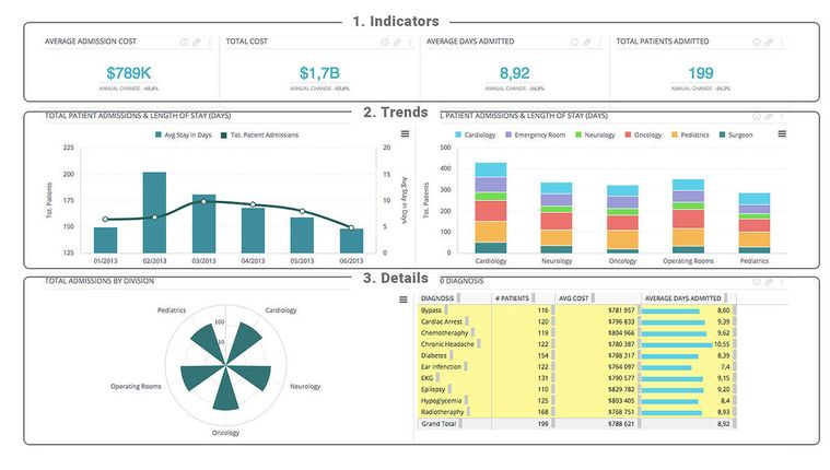
In the example of the Sisense dashboard below, we can see how the dashboard is layered top-down by importance and relevance. The top section holds the most immediate and important values, the middle section shows these values in more context, while the bottom section breaks down the same business questions into more granular details.
5. Choose the right data visualization
The right data visualization can help guide the user towards the information they’re looking for. The wrong one can confuse or add unnecessary cognitive load. Hence, this is another area where you need to be thoughtful. Sisense provides many types of widgets for visualization, so make sure you’re choosing the right one.
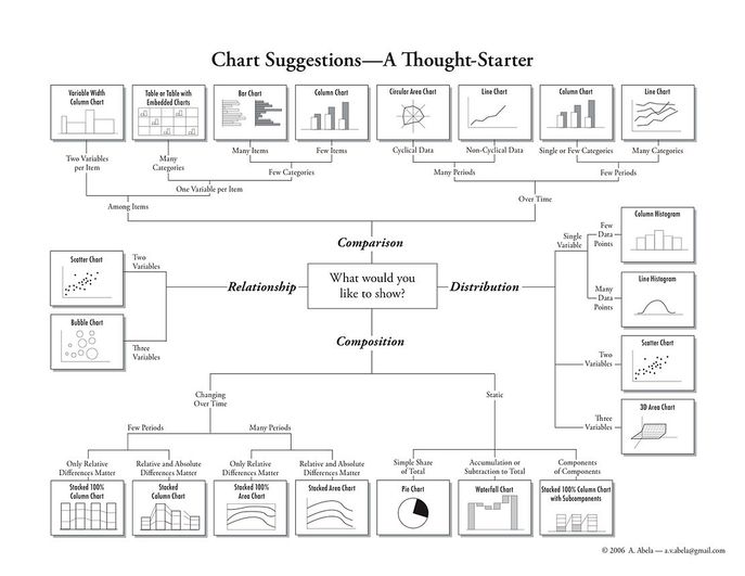
Trends will always need a line or column chart; grouping and segmentation should be done through pie charts or 100% stacked bar charts. Geographic analysis requires maps (make your Sisense maps interactive so the user can zoom in and out of countries and states. You can enable further segmentation and the capability to dive deeper into data by providing tables, pivot tables, and lists. There are several tools that can help you determine which chart to use for each kind of analysis - we like the following schema by A. Abela, 2006:
6. Advanced features and capabilities: Add-ons & plugins
Using not-out-of-the-box features such as scripts, Sisense add-ons or plugins can significantly improve dashboarding UX. Plugins can give a look and feel which is more natural looking, as well as improve on actual functionality.
Choosing the right color palette is one thing, but unlocking additional use cases and functionality will have a greater impact on adoption and engagement over time. QBeeQ provides a wide range of plugins to improve the user experience or provide new data viz capabilities.
Also, remember to take advantage of additional features and capabilities such as advanced sharing and email subscriptions, or email and Slack alerts so that users are notified immediately if a certain threshold has been passed or if an anomaly has been detected. These small changes can have a large impact on the overall user experience.
7. Start small, iterate, and experiment
Don’t push the user to advanced capabilities if there is no immediate need for them. The most powerful and useful dashboards and visualizations tend to be very simple and straightforward. Over-complicating things will create cognitive overload and will almost always lead to low engagement and loss of trust from end users.
- Keep it simple to begin with, and introduce more capabilities only if there is a business requirement for them.
- Test big changes on a small subset of dashboards before rolling them out account-wide.
- Actively collect feedback and seek to continuously improve..
Good luck and happy dashboarding!
Remember “Not everything that counts can be counted, and not everything that can be counted counts” (A. Einstein). It is our job as BI developers to enable a clear view of complex and at times non-contextual data to our users, in order to lead them to their data driven decision.
- Labels:
-
Dashboards & Reporting
- Mark as New
- Bookmark
- Subscribe
- Mute
- Subscribe to RSS Feed
- Permalink
- Report Inappropriate Content
05-29-2023 05:41 AM
Thanks for sharing @Angelina_QBeeQ very interesting read!


