This website uses Cookies. Click Accept to agree to our website's cookie use as described in our Cookie Policy. Click Preferences to customize your cookie settings.
How To Troubleshoot Build Failures (Linux OS)
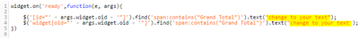
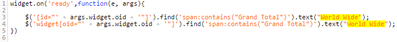
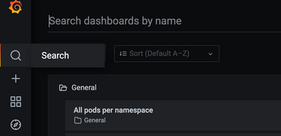
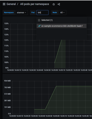
HOW TO TROUBLESHOOT BUILD FAILURES (Linux OS)Building an ElastiCube imports the data from the data source(s) that have been added. The data is stored on the Sisense instance, where future dashboard queries will be run against it. You must build an El...


![83227784_3726975083979609_8570336295451099136_n[1].jpg](/t5/image/serverpage/image-id/602i3D789947CB5B424B/image-size/medium/is-moderation-mode/true?v=v2&px=400)