- Mark as New
- Bookmark
- Subscribe
- Mute
- Subscribe to RSS Feed
- Permalink
- Report Inappropriate Content
07-05-2022 01:02 PM
I am looking at a Goal vs. Actual column chart. I have two context cases for this framework: units goal and units sold, and revenue goal and revenue collected.
I have my bar chart working correctly, but I want to change the design of it a bit to be more visually appealing.
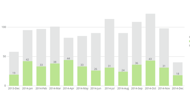
I am not satisfied with the Classic design view. It looks like this:
I have tried the Stacked and Stacked 100 views but they aren't doing what I need them to do.
I want the column charts to overlap.
If I have a product with a goal of 100 units, and we've sold 20 of them so far, the Stacked design view makes my entire bar equal 120 (combining the goal and the actual).
I don't want that. And I don't want a static goal or budget line across my graph.
I want the bar to stay at the goal of 100 and to see the 20 units sold in front of the 100 unit goal bar.
Kind of like this, visually:
Does anyone know how to do this? I think it should be a default design view option.
Thanks for the help!
- Mark as New
- Bookmark
- Subscribe
- Mute
- Subscribe to RSS Feed
- Permalink
- Report Inappropriate Content
07-06-2022 07:18 AM
Hi @oliviar ,
Try these methods:
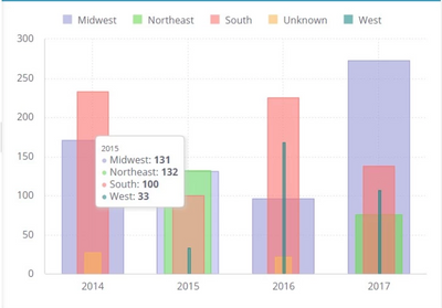
1. Columns chart with Fixed Placement: https://www.binextlevel.com/post/columns-chart-with-fixed-placement
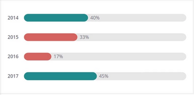
2. Convert bar chart to progress bars: https://www.binextlevel.com/post/convert-bar-chart-to-progress-bars
-Hari
- Mark as New
- Bookmark
- Subscribe
- Mute
- Subscribe to RSS Feed
- Permalink
- Report Inappropriate Content
07-07-2022 08:52 AM
One option is to remove below lines of code from the script, so that it will display default Sisense tooltip with formatted numbers.
widget.on("beforedatapointtooltip", function (se, args){
	args.cancel=true;
});ev.result.tooltip.shared = true
ev.result.tooltip.enabled = true-Hari
- Mark as New
- Bookmark
- Subscribe
- Mute
- Subscribe to RSS Feed
- Permalink
- Report Inappropriate Content
07-06-2022 04:44 AM
Hi @oliviar ,
You can play with formulas and Stacked type.
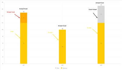
In your case, instead of Goal value use the difference between Goal and Actual. As a result, you will get the correct sum. But be careful with cases where Actual > Plan, because the difference will be negative. But you can do whatever you want with the conditions and colors. For example:
- Mark as New
- Bookmark
- Subscribe
- Mute
- Subscribe to RSS Feed
- Permalink
- Report Inappropriate Content
07-06-2022 07:18 AM
Hi @oliviar ,
Try these methods:
1. Columns chart with Fixed Placement: https://www.binextlevel.com/post/columns-chart-with-fixed-placement
2. Convert bar chart to progress bars: https://www.binextlevel.com/post/convert-bar-chart-to-progress-bars
-Hari
- Mark as New
- Bookmark
- Subscribe
- Mute
- Subscribe to RSS Feed
- Permalink
- Report Inappropriate Content
07-06-2022 07:42 AM
Thank you! I like the top one. I think this is what we are looking for. The only thing that's kind of bugging me now is when I hover over the product in the bar graph, the numbers associated with the goal and actual are not formatted the same way as they were before--they don't look as clean.

I have tried to change the format in the dashboard design and it won't change. Do you have any pointers here?
Ideally I would be able to see the comma separators, dollar signs, and reduce the decimal places so it is a rounded figure.
Thanks!
- Mark as New
- Bookmark
- Subscribe
- Mute
- Subscribe to RSS Feed
- Permalink
- Report Inappropriate Content
07-07-2022 08:52 AM
One option is to remove below lines of code from the script, so that it will display default Sisense tooltip with formatted numbers.
widget.on("beforedatapointtooltip", function (se, args){
	args.cancel=true;
});ev.result.tooltip.shared = true
ev.result.tooltip.enabled = true-Hari
- Mark as New
- Bookmark
- Subscribe
- Mute
- Subscribe to RSS Feed
- Permalink
- Report Inappropriate Content
07-07-2022 08:59 AM
This is perfect, thank you so much!


