- Community
- Legacy Discussions
- Build Analytics
- Add a Plus Sign to positive values in a Pivot Tabl...
- Subscribe to RSS Feed
- Mark Topic as New
- Mark Topic as Read
- Float this Topic for Current User
- Bookmark
- Subscribe
- Mute
- Printer Friendly Page
- Mark as New
- Bookmark
- Subscribe
- Mute
- Subscribe to RSS Feed
- Permalink
- Report Inappropriate Content
01-31-2024 06:34 AM
Hello! I was hoping there was some sort of script I can add to a Pivot Table widget that will make positive numbers for a particular value display a plus sign (+) in front of them. Consider a pivot table with three items in the "Values" section:
- Totals from one year
- Totals from the next year
- The difference between the two (i.e. subtracting A from B)
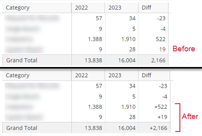
I would like to show a plus sign next to any C numbers that are positive, similar to how negative numbers show a minus sign. However, I only want this to apply to the C values and NOT the entire table; that is, positive numbers under A & B would not show a plus sign, only the numbers under C. The idea is that I want to make it visually apparent that C represents an amount of change (between A & B) and is not an actual total in-and-of-itself. Here's a mock-up of what I mean:
See how, in the "before" mockup, the numbers under the "Diff" column could potentially be mistaken for a separate set of totals. Of course, if someone is paying close attention and reading the column headers, they would realize that's not the case...however, that's my point. I want it to be obvious at-a-glance that the numbers in the last column are NOT totals but instead are the amount of change between the previous two columns. I feel that adding a plus sign to the numbers in that column (and ONLY that column) will help make this difference in purpose/function more apparent. Optionally: if anyone also has tips for applying some text formatting (italics, etc) to this column, to help make the difference even more apparent, that would also be helpful 🙂
Note: I realize that one obvious way to illustrate the difference between two sets of data is to just use a visualization like a bar chart, since then people can just visually see the difference in the size of the bars. I'm aware of this, and use those often in other contexts. However, bar/column charts are not always appropriate, so my request is for when you specifically need a Pivot Table, while still needing to show the difference between values for a given row.
There's a script to do this for an Indicator widget, but that doesn't help me because I need this for a Pivot, not an Indicator. There's also a script to do this for the tooltip pop-ups in a column chart, but again, that's not what I'm looking for. I posted comments in both of those posts asking about Pivot Tables and was told to post the question in the Build Analytics forum, which I'm doing now. Hope someone knows how to do this!
- Labels:
-
Dashboards & Reporting
- Mark as New
- Bookmark
- Subscribe
- Mute
- Subscribe to RSS Feed
- Permalink
- Report Inappropriate Content
02-05-2024 02:27 PM
Hi @Jake_Raz ,
The solution provided was for a linux instance.
This solution uses Changing Color Of Specific Cells In A Pivot Based On Textual Condition (sisense.com) as inspiration in order to achieve the same result as we have above using what we have access to in Windows Pivot.
You should be able to use the widget script below:
// Credit intapiuser
// https://community.sisense.com/t5/knowledge/changing-color-of-specific-cells-in-a-pivot-based-on-textual/ta-p/9201

var columns = [4]; //select the date columns that should be transformed

widget.on('ready', function (se, ev) {
    $.each(columns, function (index, value) {
        num = $("tbody tr:first").children().length - value;
        var e = element;
        var w = widget;
        var d = dashboard;

        $("tbody tr", e).not('.wrapper, .p-head-content').each(function () {
            var cell = $(this).children().last();
            for (var a = 0; a < num; a++) {
                cell = cell.prev();
            }

            var cell_value = cell.text()
            // make cells italic
            $(cell).css("font-style", "italic");
            if (cell_value.includes('-')) {
                // if the cell has '-' then don't add a +, but make the text red.
                $(cell).css("color", 'red');
            }
            else {
                // if the cell doesn't have a '-', then add a + to the front.
                cell.text(`+${cell_value}`)
            }
        });
    });
});
I've commented the code above, so you should be able to adjust the styling of the cell on the other end (e.g. I have made negative numbers red, and all numbers italic based on your initial post)
Let me know how you go?
Thanks,
Daniel
RAPID BI
RAPID BI - Sisense Professional Services | Implementations | Custom Add-ons
- Mark as New
- Bookmark
- Subscribe
- Mute
- Subscribe to RSS Feed
- Permalink
- Report Inappropriate Content
02-07-2024 04:05 PM
Hi @Jake_Raz ,
Great to hear it! Have no idea why column 6 was the one here, but good catch!
Here is a fix for the alignment issue:
// https://community.sisense.com/t5/knowledge/changing-color-of-specific-cells-in-a-pivot-based-on-textual/ta-p/9201

var columns = [4]; //select the date columns that should be transformed

widget.on('ready', function (se, ev) {
    $.each(columns, function (index, value) {
        num = $("tbody tr:first").children().length - value;
        var e = element;
        var w = widget;
        var d = dashboard;

        $("tbody tr", e).not('.wrapper, .p-head-content').each(function () {
            var cell = $(this).children().last();
            for (var a = 0; a < num; a++) {
                cell = cell.prev();
            }

            var cell_value = cell.text()
            // make cells italic
            $(cell).css("font-style", "italic");
            if (cell_value.includes('-')) {
                // if the cell has '-' then don't add a +, but make the text red.
                $(cell).css("color", 'red');
            }
            else {
                // if the cell doesn't have a '-', then add a + to the front.
                cell.html(`<div class="p-value">+${cell_value}</div>`)
            }
        });
    });
});
I changed the way we're modifying the cell when adding the '+', this should apply the appropriate class with css product side that's centering the value in the cell appropriately.
Feel free to reach out if you'd like to see any of our other work (styling dashboards, custom addons, etc.). If you're open to it, i'd love to hear more about how you're currently leveraging Sisense within your organization and maybe compare notes?
Thanks,
Daniel
RAPID BI
RAPID BI - Sisense Professional Services | Implementations | Custom Add-ons
- Mark as New
- Bookmark
- Subscribe
- Mute
- Subscribe to RSS Feed
- Permalink
- Report Inappropriate Content
01-31-2024 02:49 PM - edited 01-31-2024 03:43 PM
Hi @Jake_Raz ,
The widget script below uses the transformPivot function to modify a 'value cells' content.
It only does this if the cell is 1.) related to the 'Diff' column and 2.) doesn't include a '-'/minus sign (you'll see this in the code, distinctly seperated if statements).
widget.transformPivot({
    type: ['value', 'grandtotal']
  },
  function addPlusToValue(metadata, cell) {
	if (metadata.measure.title !== 'Diff') { return }
	cell.style = {
      // backgroundColor : 'lightgray',
      // fontSize : 14,
      // fontWeight : 'bold',
      fontStyle : 'italic',
      // textAlign : 'center',
      // color : 'black',
      // borderColor : 'black',
      // borderWidth : '3px',
      // minWidth : '150px',
      // maxWidth : '200px'
    }
    if (cell.content.includes('-')) { return }
	cell.content = `+${cell.content}`
  }
)
You could even add a cell.style.color before and after the 'contains '-' check' to make the text red when negative and black when positive.
@Ophir_Buchman has written an awesome article on the transformPivot function in sisense here:
Solved: Pivot 2.0 - Manipulating a Pivot Chart - Sisense Community
There is official documentation on this here:
Pivot 2.0 API | Sisense Developers
Otherwise, we're always around and happy to help - feel free to respond here or shoot me an email!
Let me know how you go?
Thanks,
Daniel
RAPID BI
RAPID BI - Sisense Professional Services | Implementations | Custom Add-ons
- Mark as New
- Bookmark
- Subscribe
- Mute
- Subscribe to RSS Feed
- Permalink
- Report Inappropriate Content
02-05-2024 06:45 AM
Hi @rapidbisupport Daniel! I tried using the script you provided but it did not work. I copy/pasted it exactly, using the same value name as before ("Diff"), then applied and refreshed, but nothing happened. It's not applying any formatting or adding a plus sign to positive numbers.
I wonder if it is due to the version of Sisense we're using? Your second link on the Pivot 2.0 API says it's only available for Linux versions of Sisense, but I'm pretty sure we're still using Windows for our particular version 😞
- Mark as New
- Bookmark
- Subscribe
- Mute
- Subscribe to RSS Feed
- Permalink
- Report Inappropriate Content
02-05-2024 02:27 PM
Hi @Jake_Raz ,
The solution provided was for a linux instance.
This solution uses Changing Color Of Specific Cells In A Pivot Based On Textual Condition (sisense.com) as inspiration in order to achieve the same result as we have above using what we have access to in Windows Pivot.
You should be able to use the widget script below:
// Credit intapiuser
// https://community.sisense.com/t5/knowledge/changing-color-of-specific-cells-in-a-pivot-based-on-textual/ta-p/9201

var columns = [4]; //select the date columns that should be transformed

widget.on('ready', function (se, ev) {
    $.each(columns, function (index, value) {
        num = $("tbody tr:first").children().length - value;
        var e = element;
        var w = widget;
        var d = dashboard;

        $("tbody tr", e).not('.wrapper, .p-head-content').each(function () {
            var cell = $(this).children().last();
            for (var a = 0; a < num; a++) {
                cell = cell.prev();
            }

            var cell_value = cell.text()
            // make cells italic
            $(cell).css("font-style", "italic");
            if (cell_value.includes('-')) {
                // if the cell has '-' then don't add a +, but make the text red.
                $(cell).css("color", 'red');
            }
            else {
                // if the cell doesn't have a '-', then add a + to the front.
                cell.text(`+${cell_value}`)
            }
        });
    });
});
I've commented the code above, so you should be able to adjust the styling of the cell on the other end (e.g. I have made negative numbers red, and all numbers italic based on your initial post)
Let me know how you go?
Thanks,
Daniel
RAPID BI
RAPID BI - Sisense Professional Services | Implementations | Custom Add-ons
- Mark as New
- Bookmark
- Subscribe
- Mute
- Subscribe to RSS Feed
- Permalink
- Report Inappropriate Content
02-07-2024 01:52 PM
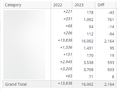
Awesome, that worked! Although, oddly, when I copy/pasted your code as-is, it applied to formatting to the wrong column:
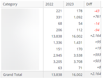
I changed "var columns" from 4 to 6 instead, and that seemed to shift it over to the correct column:
I'm curious why "4" was selecting the 2022 column, since it's not the fourth column in the view, it's the second?
Also, this is relatively minor, but do you know if its possible to adjust the formatted numbers so they're aligned the same as the non-formatted numbers? Notice how they're all scrunched up against the right-edge of the cell, and they also seem to be top-aligned instead of centered like the other numbers. I tried commenting out the italics bit, but that didn't really help.
- Mark as New
- Bookmark
- Subscribe
- Mute
- Subscribe to RSS Feed
- Permalink
- Report Inappropriate Content
02-07-2024 04:05 PM
Hi @Jake_Raz ,
Great to hear it! Have no idea why column 6 was the one here, but good catch!
Here is a fix for the alignment issue:
// https://community.sisense.com/t5/knowledge/changing-color-of-specific-cells-in-a-pivot-based-on-textual/ta-p/9201

var columns = [4]; //select the date columns that should be transformed

widget.on('ready', function (se, ev) {
    $.each(columns, function (index, value) {
        num = $("tbody tr:first").children().length - value;
        var e = element;
        var w = widget;
        var d = dashboard;

        $("tbody tr", e).not('.wrapper, .p-head-content').each(function () {
            var cell = $(this).children().last();
            for (var a = 0; a < num; a++) {
                cell = cell.prev();
            }

            var cell_value = cell.text()
            // make cells italic
            $(cell).css("font-style", "italic");
            if (cell_value.includes('-')) {
                // if the cell has '-' then don't add a +, but make the text red.
                $(cell).css("color", 'red');
            }
            else {
                // if the cell doesn't have a '-', then add a + to the front.
                cell.html(`<div class="p-value">+${cell_value}</div>`)
            }
        });
    });
});
I changed the way we're modifying the cell when adding the '+', this should apply the appropriate class with css product side that's centering the value in the cell appropriately.
Feel free to reach out if you'd like to see any of our other work (styling dashboards, custom addons, etc.). If you're open to it, i'd love to hear more about how you're currently leveraging Sisense within your organization and maybe compare notes?
Thanks,
Daniel
RAPID BI
RAPID BI - Sisense Professional Services | Implementations | Custom Add-ons
- Mark as New
- Bookmark
- Subscribe
- Mute
- Subscribe to RSS Feed
- Permalink
- Report Inappropriate Content
02-09-2024 06:14 AM
Thanks once again! I used this updated script and now everything looks awesome, I appreciate all the help 🙂
Recommended quick links to assist you in optimizing your community experience:
- Community FAQs
- Community Welcome & Guidelines
- Discussion Posting Tips
- Partner Guidelines
- Profile Settings
- Ranks & Badges
Developers Group:
Product Feedback Forum:
Need additional support?:
The Legal Stuff
Have a question about the Sisense Community?
Email [email protected]
- Can use use Switchable Dimensions for Line and Area Charts in Build Analytics
- Return members from dashboard script in Build Analytics
- Show Title(dimension) with mode price in Pivot table values in Build Analytics
- Horizontal Contribution in Build Analytics
- How to resize width of values columns in pivot widget in Build Analytics


