This website uses Cookies. Click Accept to agree to our website's cookie use as described in our Cookie Policy. Click Preferences to customize your cookie settings.
- Community
- Legacy Discussions
- Build Analytics
- Re: Bell Curves in Sisense
- Subscribe to RSS Feed
- Mark Topic as New
- Mark Topic as Read
- Float this Topic for Current User
- Bookmark
- Subscribe
- Mute
- Printer Friendly Page
- Mark as New
- Bookmark
- Subscribe
- Mute
- Subscribe to RSS Feed
- Permalink
- Report Inappropriate Content
11-22-2021 01:37 PM
Anyone out there have a simple way to present Bell Curves?
I found this post, but have not been able to make it work. Anyone have a better idea?
- Labels:
-
Dashboards & Reporting
- Mark as New
- Bookmark
- Subscribe
- Mute
- Subscribe to RSS Feed
- Permalink
- Report Inappropriate Content
01-10-2022 06:37 AM
I was able to simplify the script.
You no longer require the "Median" and "SD" values.
Just configure the following variables:
- dataLabel - Your data series name
- sdLevels - The number of SD levels to display (1 means -1/+1 l 2 means -2/-1/+1/+2) | etc.)
var debug = true;

function getMedian(sorted) {
    const middle = Math.floor(sorted.length / 2);

    if (sorted.length % 2 === 0)
        return (sorted[middle - 1] + sorted[middle]) / 2;
    else
		return sorted[middle];
}

function getStandardDeviation(numArray) {
  const mean = numArray.reduce((s, n) => s + n) / numArray.length;
  const variance = numArray.reduce((s, n) => s + (n - mean) ** 2, 0) / (numArray.length - 1);
  return Math.sqrt(variance);
}

function getAxisLocation(rangeArray,value) {
	// Calculates the {value} relative location on the {rangeArray} axis
    for (let i=1 ; i< rangeArray.length; i++) {
        if (parseFloat(rangeArray[i-1]) <= value && value <= parseFloat(rangeArray[i])) {
			// If within the range of the datapoints [i-1] and [i]
            return (i-1) + (value-parseFloat(rangeArray[i-1])) / parseFloat((rangeArray[i])-rangeArray[i-1]);
        }
    }

	// The value isn't within the axis range
    return -1;
}


widget.on('processresult',function(w,ev) {

	var widgetID = w._id;
	var sdLevels = 2;
	var dataLabel = 'Frequency';

	//scan the "Values"
	$.each(ev.result.series, function(i, v) {
		switch(v.name) {
			case dataLabel:
				valueArray = [];
				for (let i = 0 ; i< v.data.length ; i++) {for (let j = 0 ; j < v.data[i].y ; j++ ) {valueArray.push(parseFloat(ev.result.xAxis.categories[i]))}};
				MedianVal = getMedian(valueArray);
				if (debug) console.log (widgetID + ' - Found "Median" with a value of ' + MedianVal);
				StdevPVal = getStandardDeviation(valueArray);
				if (debug) console.log (widgetID + ' - Found "Population StDev" with a value of ' + StdevPVal);
				break;
		}
	});

	// Fix highcharts bug that prevents showing vertical line labels
	// Details: https://github.com/highcharts/highcharts/issues/8477
	Highcharts.wrap(Highcharts.Axis.prototype, 'getPlotLinePath', function(proceed) {
		var path = proceed.apply(this, Array.prototype.slice.call(arguments, 1));
		if (path) {
			path.flat = false;
		}
		return path;
	});

	// Initialize the vertical lines array
	ev.result.xAxis.plotLines = [];

	// Add the vertical lines
	for (let i=-sdLevels;i<=sdLevels; i++) {
		Value = MedianVal + i * StdevPVal
		Position = getAxisLocation(ev.result.xAxis.categories,Value);

		if (debug) console.log (widgetID + ' - Handling i=' + i +' Value=' + Value + ' Position=' + Position)

		switch (Math.abs(i)) {
			case 0:
				Color = 'Red'
				Text = 'Median (' + Value.toFixed(2) + ')'
				break;
			case 1:
				Color = 'Blue'
				Text = i + 'SD (' + Value.toFixed(2) + ')'
				break;
			case 2:
				Color = 'Grey'
				Text = i + 'SD'
				break;
		}


		if (Position != -1) ev.result.xAxis.plotLines.push(
			{
				color: Color,
				width: 2,
				dashStyle: "dash",
				value: Position,
				label: {
					text: Text,
					rotation:0,
					textAlign: "center",
					style:{fontFamily: "abelregular"},
					y:15,
					x:-3
				}
			})
		else
			if (debug) console.log (widgetID + ' - The "SD ' + i +'" line is out of the X Axis range (' + Value + ') - Skipping')
	}
})
- Mark as New
- Bookmark
- Subscribe
- Mute
- Subscribe to RSS Feed
- Permalink
- Report Inappropriate Content
01-10-2022 10:54 PM
- Mark as New
- Bookmark
- Subscribe
- Mute
- Subscribe to RSS Feed
- Permalink
- Report Inappropriate Content
12-23-2021 01:24 AM
Hi @Silutions,
Can you please share the post you are referring to?
Also, can you please elaborate on the use case? Show a visual example?
Thanks,
Ophir
- Mark as New
- Bookmark
- Subscribe
- Mute
- Subscribe to RSS Feed
- Permalink
- Report Inappropriate Content
12-23-2021 08:40 AM
Ophir,
The post is here: https://support.sisense.com/kb/en/article/create-bell-curve-in-a-widget
Sorry, didn't realize I hadn't linked the post I was referring to.
Regards, Jim
- Mark as New
- Bookmark
- Subscribe
- Mute
- Subscribe to RSS Feed
- Permalink
- Report Inappropriate Content
12-24-2021 01:49 AM
Hi @Silutions,
I thought you were referring to this article 🙂
Would you mind elaborating on the use case and what you are attempting to achieve? As requested - A visual example and a before/after mockup would be appreciated
Thanks,
Ophir
- Mark as New
- Bookmark
- Subscribe
- Mute
- Subscribe to RSS Feed
- Permalink
- Report Inappropriate Content
12-28-2021 08:10 AM
Ophir,
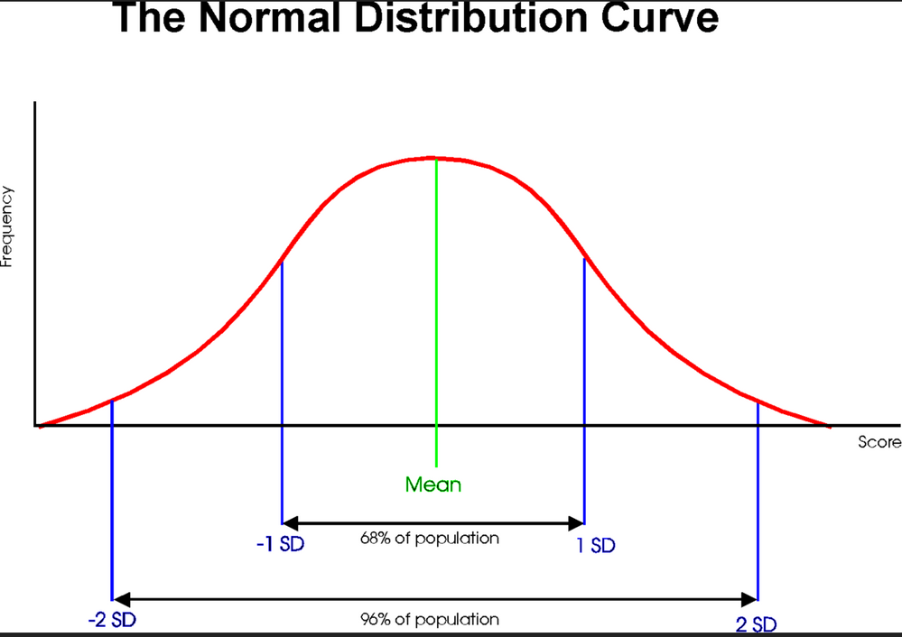
The use case is the same as the article. The client has test results data and they want to present the analysis as a bell curve. See the image below:
They would like to show both the curve and the vertical lines at plus and minus one and two standard deviations. They would also like to show the y value labels. See this article on how to create a bell curve in Excel: https://support.microsoft.com/en-us/office/how-to-create-a-bell-curve-chart-eaa398ef-ac0c-4f8e-b19a-...
Thanks for your interest in this. Please let me know if you would like to discuss.
Regards, Jim
- Mark as New
- Bookmark
- Subscribe
- Mute
- Subscribe to RSS Feed
- Permalink
- Report Inappropriate Content
12-29-2021 04:11 AM
There might be various complex ways to do so, but the easiest one may be this:
https://support.sisense.com/kb/en/article/add-background-image-to-charts
Let me know if that works for you 🙂
- Mark as New
- Bookmark
- Subscribe
- Mute
- Subscribe to RSS Feed
- Permalink
- Report Inappropriate Content
12-29-2021 12:18 PM
Ophir,
Sorry if I confused you. I was trying to provide an example of the finished product. The red line above is a line chart of the count (frequency) of the value of interest. The vertical blue lines are at the plus and minus one and two standard deviations. The green mean vertical line is nice, but not critical. This is not a static image, but a dynamically calculated chart like the original post ( https://support.sisense.com/kb/en/article/create-bell-curve-in-a-widget) I could not make work.
Regards
- Mark as New
- Bookmark
- Subscribe
- Mute
- Subscribe to RSS Feed
- Permalink
- Report Inappropriate Content
12-30-2021 02:41 AM
Hi @Silutions,
After a long script investigation, I've identified a few errors and constants that were placed into the code which are "example specific".
Bottom Line is that requires more work than just copying a script.
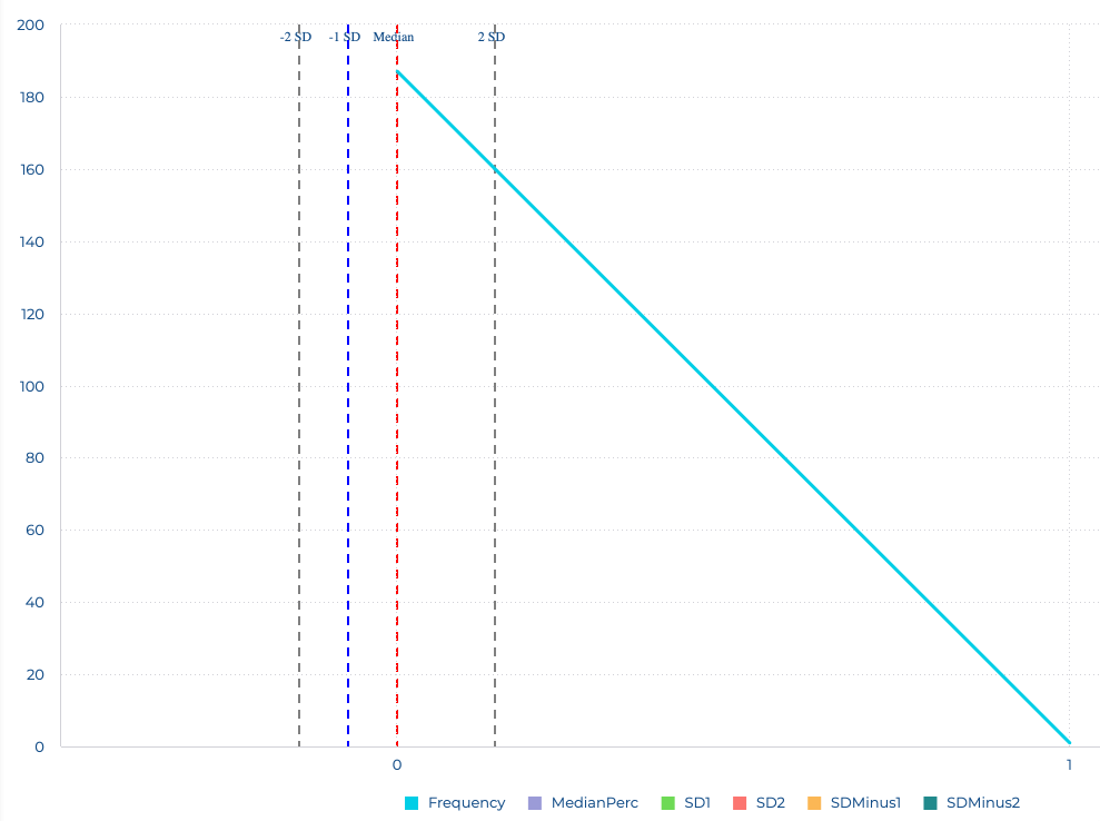
I've made a few modifications and ended out with the following example - Let me know if this answers your needs and I'll share the script with you:
The red line is mean
Blue lines are SD +/- 1
Grey lines are SD +/- 2 (this specific graph only shows one of them)
- Mark as New
- Bookmark
- Subscribe
- Mute
- Subscribe to RSS Feed
- Permalink
- Report Inappropriate Content
12-30-2021 06:43 AM
Ophir,
This looks right to me. My only comment is that in the original post the values were in percent. Our values are not percentages. I don't see why that should make a difference though.
Regards, Jim
- Mark as New
- Bookmark
- Subscribe
- Mute
- Subscribe to RSS Feed
- Permalink
- Report Inappropriate Content
12-30-2021 07:07 AM
The steps to create this:
- Create a new "line chart" widget
- Select an "X-Axis" ("Scores" in my example)
- Select a "Value" ("Frequency" in my example)
- Create a value named "MedianPerc" providing the median of scores.
I used the formula "(MEDIAN([Score]),ALL([Score]))" - Create a value named "SD1" providing the SD+1 value.
I used the formula "(MEDIAN([Score]),ALL([Score])) + (STDEV([Score]),ALL([Score]))" - Create a value named "SDMinus1" providing the SD-1 value.
I used the formula "(MEDIAN([Score]),ALL([Score])) - (STDEV([Score]),ALL([Score]))" - Create a value named "SD2" providing the SD+2 value.
I used the formula "(MEDIAN([Score]),ALL([Score])) + 2*(STDEV([Score]),ALL([Score]))" - Create a value named "SDMinus2" providing the SD-1 value.
I used the formula "(MEDIAN([Score]),ALL([Score])) - 2*(STDEV([Score]),ALL([Score]))" - Write the following code in the widget script:
widget.on('processresult',function(w,ev) {
var s = ev.result.series;
var MedianPerc = "MedianPerc";
var MedianPercVal;
var SD1 = "SD1";
var SD1Val;
var SDMinus1 = "SDMinus1"
var SDMinus1Val;
var SD2 = "SD2";
var SD2Val;
var SDMinus2 = "SDMinus2"
var SDMinus2Val;
$.each(s, function(i, v) {
switch(v.name) {
case MedianPerc:
MedianPercVal = (v.data[0].y) //* 1000;
v.data = null
break;
case SD1:
SD1Val = v.data[0].y;
v.data = null
break;
case SDMinus1:
SDMinus1Val = v.data[0].y;
v.data = null
break;
case SD2:
SD2Val = v.data[0].y;
v.data = null
break;
case SDMinus2:
SDMinus2Val = v.data[0].y;
v.data = null
break;
}
});
ev.result.xAxis.plotLines= [
{
color: 'Red',
width: 2,
dashStyle: "dash",
value: MedianPercVal,
label: {
text: "Median",
rotation:0,
textAlign: "center",
style:{fontFamily: "abelregular"},
y:30,
x:0
}
},
{
color: 'Blue',
width: 2,
dashStyle: "dash",
value: SD1Val,
label: {text: "1 SD",
rotation:0,
textAlign: "center",
style:{fontFamily: "abelregular"},
y:15,
x:-3
}
},
{
color: 'Blue',
width: 2,
dashStyle: "dash",
value: SDMinus1Val,
label: {text: "-1 SD",
rotation:0,
textAlign: "center",
style:{fontFamily: "abelregular"},
y:15,
x:-3
}
},
{
color: 'Grey',
width: 2,
dashStyle: "dash",
value: SD2Val,
label: {text: "2 SD",// + ((SD2Val)/10).toFixed(2) +'%',
rotation:0,
textAlign: "center",
style:{fontFamily: "abelregular"},
y:15,
x:-3
}
},
{
color: 'Grey',
width: 2,
dashStyle: "dash",
value: SDMinus2Val,
label: {text: "-2 SD",// + ((SDMinus2Val)/10).toFixed(2) +'%',
rotation:0,
textAlign: "center",
style:{fontFamily: "abelregular"},
y:15,
x:-3
}
}
]
})
Enjoy,
Ophir
- Mark as New
- Bookmark
- Subscribe
- Mute
- Subscribe to RSS Feed
- Permalink
- Report Inappropriate Content
12-30-2021 10:38 AM
Ophir,
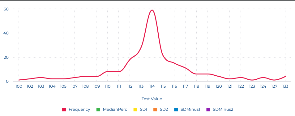
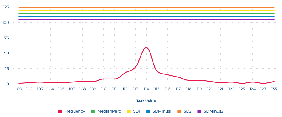
We must be close, but I'm not getting the SD lines. See my results below:
Here is the chart with script removed. The Median and SD values are correct so I'm not quite sure what is going wrong since the JavaScript is obviously technically correct since it is hiding the Median and SD lines.
Thanks for all your help with this, Jim
- Mark as New
- Bookmark
- Subscribe
- Mute
- Subscribe to RSS Feed
- Permalink
- Report Inappropriate Content
12-30-2021 11:06 AM
Hi @Silutions,
Can you please check a few things:
- What is the Sisense version you're running?
- Open the developer mode and let me know if you see any errors while loading the page with the script enabled
- Add the following code to the end of the script (right after the "]" line): "console.log(ev.result.xAxis.plotLines)"
The developer mode console should throw you the print
Should look something like:
- Mark as New
- Bookmark
- Subscribe
- Mute
- Subscribe to RSS Feed
- Permalink
- Report Inappropriate Content
12-30-2021 11:28 AM
Ophir,
Running Windows 20.21.6.10052. Didn't spot any errors in the console. Result of console log statement is:
These values are correct. So I'm surprised they aren't plotting.
Regards, Jim
- Mark as New
- Bookmark
- Subscribe
- Mute
- Subscribe to RSS Feed
- Permalink
- Report Inappropriate Content
12-30-2021 11:34 AM
Ophir,
I should have said no errors except the ones I always see, but for what it's worth here they are:
- Mark as New
- Bookmark
- Subscribe
- Mute
- Subscribe to RSS Feed
- Permalink
- Report Inappropriate Content
12-31-2021 02:41 AM
Hi @Silutions,
Happy to say I was able to implement the code in a Windows machine running 20.21.6.10052.
Enclosed is the dashboard - Please import it and use the "Sample Retail" dataset as a data source
Enjoy - Happy new year
- Mark as New
- Bookmark
- Subscribe
- Mute
- Subscribe to RSS Feed
- Permalink
- Report Inappropriate Content
12-31-2021 02:42 AM
- Mark as New
- Bookmark
- Subscribe
- Mute
- Subscribe to RSS Feed
- Permalink
- Report Inappropriate Content
01-03-2022 12:06 PM
Ophir,
Dashboard loaded fine and presents the data from the Sample Lead Generation EC fine. However, with our data, which is an almost perfect Bell Curve data set, the Median, SD, etc. lines do not show. See screen shot below:

I imported the attached exported data file to my system to see if there was something odd about the Client's system, but I get the same behavior.
Thank you for continuing to persevere on this.
Happy New Year, Jim
- Mark as New
- Bookmark
- Subscribe
- Mute
- Subscribe to RSS Feed
- Permalink
- Report Inappropriate Content
01-03-2022 12:48 PM
Hi @Silutions,
I see what's going on 🙂
Try changing this part of the code:
$.each(s, function(i, v) {
switch(v.name) {
case MedianPerc:
MedianPercVal = (v.data[0].y) - parseInt(ev.result.xAxis.categories[0]);
v.data = null
break;
case SD1:
SD1Val = v.data[0].y - parseInt(ev.result.xAxis.categories[0]);
v.data = null
break;
case SDMinus1:
SDMinus1Val = v.data[0].y - parseInt(ev.result.xAxis.categories[0]);
v.data = null
break;
case SD2:
SD2Val = v.data[0].y - parseInt(ev.result.xAxis.categories[0]);
v.data = null
break;
case SDMinus2:
SDMinus2Val = v.data[0].y - parseInt(ev.result.xAxis.categories[0]);
v.data = null
break;
}
});
My axis started from 0 - Yours didn't
Ophir
- Mark as New
- Bookmark
- Subscribe
- Mute
- Subscribe to RSS Feed
- Permalink
- Report Inappropriate Content
01-03-2022 01:26 PM
Ophir,
Getting closer. The Median and SD lines are now present except for SD1, but the values are incorrect as you can see from the pivot to the right.
Regards, Jim
- Mark as New
- Bookmark
- Subscribe
- Mute
- Subscribe to RSS Feed
- Permalink
- Report Inappropriate Content
01-04-2022 01:42 AM
Hi @Silutions ,
There were 3 issues in the original script:
- The Range doesn't always start at 0
- The intervals between the categories are not always 1
- The X-Axis isn't 100% linear
Please use the following code instead:
var debug = true;

function getAxisLocation(rangeArray,value) {
    for (let i=1 ; i< rangeArray.length; i++) {
        if (parseFloat(rangeArray[i-1]) <= value && value <= parseFloat(rangeArray[i])) {
            return (i-1) + (value-parseFloat(rangeArray[i-1])) / parseFloat((rangeArray[i])-rangeArray[i-1]);
        }
    }
    return -1;
}

widget.on('processresult',function(w,ev) {

	var widgetID = w._id;
	var s = ev.result.series;
	var MedianPerc = "MedianPerc";
	var MedianPercVal;
	var SD1 = "SD1";
	var SD1Val;
	var SDMinus1 = "SDMinus1"
	var SDMinus1Val;
	var SD2 = "SD2";
	var SD2Val;
	var SDMinus2 = "SDMinus2"
	var SDMinus2Val;

	$.each(s, function(i, v) {
		switch(v.name) {
			case MedianPerc:
				MedianPercVal = getAxisLocation(ev.result.xAxis.categories,v.data[0].y)
				if (debug) console.log (widgetID + ' - Found "Median" with a value of ' + (v.data[0].y) + ' - Placing at data point ' + MedianPercVal);

				v.data = null;
				break;

			case SD1:
				SD1Val = getAxisLocation(ev.result.xAxis.categories,v.data[0].y)
				if (debug) console.log (widgetID + ' - Found "SD+1" with a value of ' + v.data[0].y + ' - Placing at data point ' + SD1Val);

				v.data = null;
				break;

			case SDMinus1:
				SDMinus1Val = getAxisLocation(ev.result.xAxis.categories,v.data[0].y)
				if (debug) console.log (widgetID + ' - Found "SD-1" with a value of ' + v.data[0].y + ' - Placing at data point ' + SDMinus1Val);

				v.data = null;
				break;

			case SD2:
				SD2Val = getAxisLocation(ev.result.xAxis.categories,v.data[0].y)
				if (debug) console.log (widgetID + ' - Found "SD+2" with a value of ' + v.data[0].y + ' - Placing at data point ' + SD2Val);

				v.data = null;
				break;

			case SDMinus2:
				SDMinus2Val = getAxisLocation(ev.result.xAxis.categories,v.data[0].y)
				if (debug) console.log (widgetID + ' - Found "SD-2" with a value of ' + v.data[0].y + ' - Placing at data point ' + SDMinus2Val);

				v.data = null;
				break;

		}
	});

	// Fix highcharts bug
	Highcharts.wrap(Highcharts.Axis.prototype, 'getPlotLinePath', function(proceed) {
		var path = proceed.apply(this, Array.prototype.slice.call(arguments, 1));
		if (path) {
			path.flat = false;
		}
		return path;
	});

	ev.result.xAxis.plotLines= [];

	if (MedianPercVal != -1) ev.result.xAxis.plotLines.push(
		{
			color: 'Red',
			width: 2,
			dashStyle: "dash",
			value: MedianPercVal,
			label: {
				text: "Median",
				rotation:0,
				textAlign: "center",
				style:{fontFamily: "abelregular"},
				y:15,
				x:-3
			}
		})
	else
		if (debug) console.log ('The "Median" line is out of the X Axis range - Skipping')

	if (SD1Val != -1) ev.result.xAxis.plotLines.push(
		{
			color: 'Blue',
			width: 2,
			dashStyle: "dash",
			value: SD1Val,
			label: {
				text: "1 SD",
				rotation:0,
				textAlign: "center",
				style:{fontFamily: "abelregular"},
				y:15,
				x:-3
			}
		})
	else
		if (debug) console.log ('The "SD +1" line is out of the X Axis range - Skipping')

	if (SDMinus1Val != -1) ev.result.xAxis.plotLines.push(
		{
			color: 'Blue',
			width: 2,
			dashStyle: "dash",
			value: SDMinus1Val,
			label: {
				text: "-1 SD",
				rotation:0,
				textAlign: "center",
				style:{fontFamily: "abelregular"},
				y:15,
				x:-3
			}
		})
	else
		if (debug) console.log ('The "SD -1" line is out of the X Axis range - Skipping')

	if (SD2Val != -1) ev.result.xAxis.plotLines.push(
		{
			color: 'Grey',
			width: 2,
			dashStyle: "dash",
			value: SD2Val,
			label: {
				text: "2 SD",// + ((SD2Val)/10).toFixed(2) +'%',
				rotation:0,
				textAlign: "center",
				style:{fontFamily: "abelregular"},
				y:15,
				x:-3
			}
		})
	else
		if (debug) console.log ('The "SD +2" line is out of the X Axis range - Skipping')

	if (SDMinus2Val != -1) ev.result.xAxis.plotLines.push(
		{
			color: 'Grey',
			width: 2,
			dashStyle: "dash",
			value: SDMinus2Val,
			label: {
				text: "-2 SD",// + ((SDMinus2Val)/10).toFixed(2) +'%',
				rotation:0,
				textAlign: "center",
				style:{fontFamily: "abelregular"},
				y:15,
				x:-3
			}
		})
	else
		if (debug) console.log ('The "SD -2" line is out of the X Axis range - Skipping')
})
Please note the code print debug information to the console
Feel free to change the debug flag to "false" to get rid of them
Ophir
- Mark as New
- Bookmark
- Subscribe
- Mute
- Subscribe to RSS Feed
- Permalink
- Report Inappropriate Content
01-04-2022 09:26 AM
Ophir,
This looks correct to me and appears to be a more robust solution. We will test across a few more of our analyses and let you know. As you pointed out, the original script was built around a frequency value based on percentages and therefore was always > 0 and had even x axis intervals. This is a fairly low percentage of Bell Curve use cases. Your generalization addresses these limitations. I recognize you did a lot of work on this and it is appreciated by both me and our customer. I suggest you add this solution as a support article as I think many folks looking for a Bell Curve solution will be grateful for it.
Regards, Jim
- Mark as New
- Bookmark
- Subscribe
- Mute
- Subscribe to RSS Feed
- Permalink
- Report Inappropriate Content
01-05-2022 05:11 AM
Please let me know if this covers your use case (Use the "Accept as Solution" button) and I'll post it
Ophir
- Mark as New
- Bookmark
- Subscribe
- Mute
- Subscribe to RSS Feed
- Permalink
- Report Inappropriate Content
01-07-2022 02:55 PM
Ophir,
I did some additional testing with our customer today. This looks very good. One additional requirement the customer came up with was having it work with the "break by" so that multiple suppliers could be compared.
Any interest in taking that on? If not, I'll accept as solution.
Regards, Jim
- Mark as New
- Bookmark
- Subscribe
- Mute
- Subscribe to RSS Feed
- Permalink
- Report Inappropriate Content
01-10-2022 01:12 AM
Hi @Silutions
This will make the script a bit more complex - But more important, it will make the visualization unreadable.
I'd suggest one of the following:
1. Having them use multiple line charts
2. Having them only display the median of each category (use the median formula in the SD1,SD2, etc.)
- Mark as New
- Bookmark
- Subscribe
- Mute
- Subscribe to RSS Feed
- Permalink
- Report Inappropriate Content
01-10-2022 09:56 AM
Ophir,
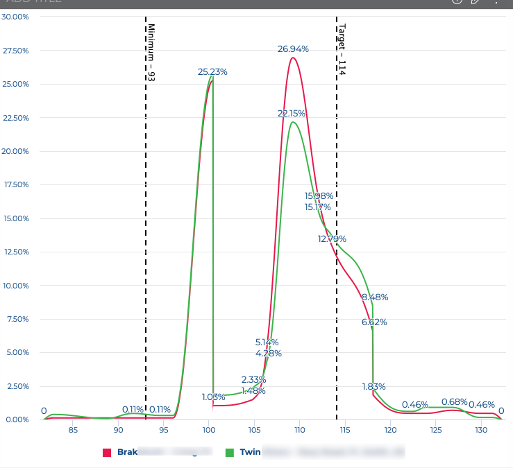
The goal is for them to compare several different suppliers performance. It actually is not unreadable. See screen shot below:
- Mark as New
- Bookmark
- Subscribe
- Mute
- Subscribe to RSS Feed
- Permalink
- Report Inappropriate Content
01-10-2022 06:37 AM
I was able to simplify the script.
You no longer require the "Median" and "SD" values.
Just configure the following variables:
- dataLabel - Your data series name
- sdLevels - The number of SD levels to display (1 means -1/+1 l 2 means -2/-1/+1/+2) | etc.)
var debug = true;

function getMedian(sorted) {
    const middle = Math.floor(sorted.length / 2);

    if (sorted.length % 2 === 0)
        return (sorted[middle - 1] + sorted[middle]) / 2;
    else
		return sorted[middle];
}

function getStandardDeviation(numArray) {
  const mean = numArray.reduce((s, n) => s + n) / numArray.length;
  const variance = numArray.reduce((s, n) => s + (n - mean) ** 2, 0) / (numArray.length - 1);
  return Math.sqrt(variance);
}

function getAxisLocation(rangeArray,value) {
	// Calculates the {value} relative location on the {rangeArray} axis
    for (let i=1 ; i< rangeArray.length; i++) {
        if (parseFloat(rangeArray[i-1]) <= value && value <= parseFloat(rangeArray[i])) {
			// If within the range of the datapoints [i-1] and [i]
            return (i-1) + (value-parseFloat(rangeArray[i-1])) / parseFloat((rangeArray[i])-rangeArray[i-1]);
        }
    }

	// The value isn't within the axis range
    return -1;
}


widget.on('processresult',function(w,ev) {

	var widgetID = w._id;
	var sdLevels = 2;
	var dataLabel = 'Frequency';

	//scan the "Values"
	$.each(ev.result.series, function(i, v) {
		switch(v.name) {
			case dataLabel:
				valueArray = [];
				for (let i = 0 ; i< v.data.length ; i++) {for (let j = 0 ; j < v.data[i].y ; j++ ) {valueArray.push(parseFloat(ev.result.xAxis.categories[i]))}};
				MedianVal = getMedian(valueArray);
				if (debug) console.log (widgetID + ' - Found "Median" with a value of ' + MedianVal);
				StdevPVal = getStandardDeviation(valueArray);
				if (debug) console.log (widgetID + ' - Found "Population StDev" with a value of ' + StdevPVal);
				break;
		}
	});

	// Fix highcharts bug that prevents showing vertical line labels
	// Details: https://github.com/highcharts/highcharts/issues/8477
	Highcharts.wrap(Highcharts.Axis.prototype, 'getPlotLinePath', function(proceed) {
		var path = proceed.apply(this, Array.prototype.slice.call(arguments, 1));
		if (path) {
			path.flat = false;
		}
		return path;
	});

	// Initialize the vertical lines array
	ev.result.xAxis.plotLines = [];

	// Add the vertical lines
	for (let i=-sdLevels;i<=sdLevels; i++) {
		Value = MedianVal + i * StdevPVal
		Position = getAxisLocation(ev.result.xAxis.categories,Value);

		if (debug) console.log (widgetID + ' - Handling i=' + i +' Value=' + Value + ' Position=' + Position)

		switch (Math.abs(i)) {
			case 0:
				Color = 'Red'
				Text = 'Median (' + Value.toFixed(2) + ')'
				break;
			case 1:
				Color = 'Blue'
				Text = i + 'SD (' + Value.toFixed(2) + ')'
				break;
			case 2:
				Color = 'Grey'
				Text = i + 'SD'
				break;
		}


		if (Position != -1) ev.result.xAxis.plotLines.push(
			{
				color: Color,
				width: 2,
				dashStyle: "dash",
				value: Position,
				label: {
					text: Text,
					rotation:0,
					textAlign: "center",
					style:{fontFamily: "abelregular"},
					y:15,
					x:-3
				}
			})
		else
			if (debug) console.log (widgetID + ' - The "SD ' + i +'" line is out of the X Axis range (' + Value + ') - Skipping')
	}
})
- Mark as New
- Bookmark
- Subscribe
- Mute
- Subscribe to RSS Feed
- Permalink
- Report Inappropriate Content
01-10-2022 10:05 AM
Ophir,
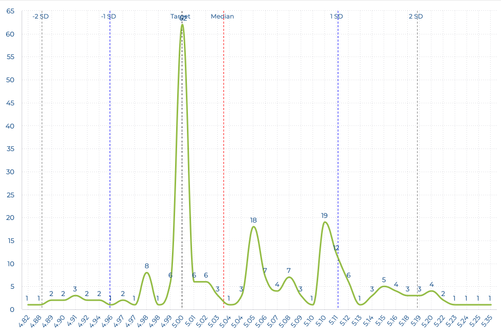
This makes it much easier to implement. I had added a Target line to your original solution by adding a Value target to the chart and then adding on to your script. See screen shot:
I can't figure out how to do that with your new code. Can you help us out with that?
Regards, Jim
- Mark as New
- Bookmark
- Subscribe
- Mute
- Subscribe to RSS Feed
- Permalink
- Report Inappropriate Content
01-10-2022 10:13 AM
Hi @Silutions ,
You'll just have to add an additional "push" command to the code after the loop - Just like the original code
Ophir
- Mark as New
- Bookmark
- Subscribe
- Mute
- Subscribe to RSS Feed
- Permalink
- Report Inappropriate Content
01-10-2022 11:58 AM
Ophir,
Did that (I think) and got my Target line, but my plot line has now disappeared. Rather copying in all the code, attached is my test dashboard (with extension changed to .txt). Note that this widget has a separate data value, Frequency%, we are using to calculate the % of the Frequency count at each value. There is a script at that sets the opacity of that value (set to column chart) to 0 to hide the columns. We are just displaying the labels. I've removed that script and the Frequency% value, but that didn't get my plot line back. I guess I need more help. As you can tell, I'm not that good with JavaScript.
Regards, Jim
- Mark as New
- Bookmark
- Subscribe
- Mute
- Subscribe to RSS Feed
- Permalink
- Report Inappropriate Content
01-10-2022 10:54 PM
- Mark as New
- Bookmark
- Subscribe
- Mute
- Subscribe to RSS Feed
- Permalink
- Report Inappropriate Content
01-11-2022 09:52 AM
Ophir,
That did it. Again, thank you!
Regards, Jim
- Mark as New
- Bookmark
- Subscribe
- Mute
- Subscribe to RSS Feed
- Permalink
- Report Inappropriate Content
03-15-2022 11:08 AM
Ophir,
New customer requirement: show bell curves for multiple values of the category. Ex. show 3 bell curves on same chart. One each for Supplier A, Suppler B and Supplier C to allow us to compare their performance. The number of category choices should be selectable from a dashboard filter from 1 to n generating 1 to n bell curves on the same same set of axes.
Bad example shown below:
Any chance you'd be willing to take a look at this?
Regards, Jim
Recommended Quick Links
- Community FAQs
- Community Welcome & Guidelines
- Discussion Posting Tips
- Partner Guidelines
- Profile Settings
- Ranks & Badges
Developers:
Product Feedback Forum:
Need additional support?:
The Legal Stuff
Have a question about the Sisense Community?
Email [email protected]

