- Community
- Forums
- Software Developers
- Re: Create vertical line in line chart with dates ...
- Subscribe to RSS Feed
- Mark Topic as New
- Mark Topic as Read
- Float this Topic for Current User
- Bookmark
- Subscribe
- Mute
- Printer Friendly Page
Create vertical line in line chart with dates as x-axis
- Mark as New
- Bookmark
- Subscribe
- Mute
- Subscribe to RSS Feed
- Permalink
- Report Inappropriate Content
02-28-2024 11:26 PM
hello,
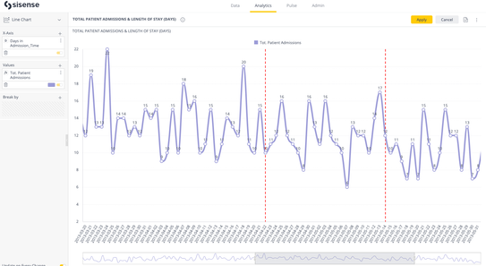
I am trying to add vertial lines (indicating event in time) to a simple line chart with dates as x-axis.
Unfurtunatly i succeeded only adding a single line according to index on x-axis and not value.
Questions:
1. How can i add the line for specific values (dates)?
2. How can i add more than one line?
3. The label i added is not shown. any idea why?
widget.on('beforeviewloaded', function(widget, ev){
	ev.options.xAxis.plotLines = [{
		color: 'red',
		dashStyle: 'ShortDash',
		width: 2,
		value: 9,
		label : {
			text : 'ver2'
		}
	}]

});
- Labels:
-
Developers
- Mark as New
- Bookmark
- Subscribe
- Mute
- Subscribe to RSS Feed
- Permalink
- Report Inappropriate Content
02-29-2024 01:24 AM
Hi @eshaul ,
Please review the example scripts provided in the "How to Get a Vertical Line in the X-Axis in a Line Chart" article and let us know if it helps to achieve your goal.
Best,
Lily
Lily
- Mark as New
- Bookmark
- Subscribe
- Mute
- Subscribe to RSS Feed
- Permalink
- Report Inappropriate Content
02-29-2024 01:42 AM
Hi @Liliia_DevX ,
Thanks for your reply, i am familiar with this thread, already looked at it, it is not helping me with the 3 issues i mentioned
Thanks,
Erez.
- Mark as New
- Bookmark
- Subscribe
- Mute
- Subscribe to RSS Feed
- Permalink
- Report Inappropriate Content
03-02-2024 01:20 AM
Hi @Liliia_DevX ,
As i wrote, the reference was not helpful, any other idea where can i look?
- Mark as New
- Bookmark
- Subscribe
- Mute
- Subscribe to RSS Feed
- Permalink
- Report Inappropriate Content
03-04-2024 02:10 AM
Hi @eshaul,
Please try to use the following script as an example to implement your own solution:
widget.on('processresult', function(w, ev) {
    let targetDates = ["2013-04-22T00:00:00", "2013-05-14T00:00:00"]; // Change these to your desired dates
    let indices = [];

    targetDates.forEach((targetDate) => {
        let currentDate = new Date(targetDate);
        ev.rawResult?.values.forEach((v, i) => {
            // Assuming the x-axis values are dates, compare them with the target date
            let dataDate = new Date(v[0].data);
            if (currentDate.getTime() === dataDate.getTime()) {
                indices.push(i);
            }
        });
    });

    if (indices.length > 0) {
        ev.result.xAxis.plotLines = indices.map((index) => {
            return {
                color: '#FF0000',
                width: 2,
                dashStyle: "dash",
                value: index
            };
        });
    }
});
You need to adjust targetDates to make it work for the specific dates. It was tested with the following widget configuration:
I'm afraid we don't have a ready-to-use example script to show also labels and it requires a further development investigation and implementation.
Hope this code snippet helps!
Best Regards, Lily
Lily
- Mark as New
- Bookmark
- Subscribe
- Mute
- Subscribe to RSS Feed
- Permalink
- Report Inappropriate Content
03-06-2024 12:24 AM
Dear @Liliia_DevX thanks a lot - that is working for me.
Unfortunately, the label feature is a must, I tried to add it to the plotLines property, but it's not showing, any idea why?
- Mark as New
- Bookmark
- Subscribe
- Mute
- Subscribe to RSS Feed
- Permalink
- Report Inappropriate Content
03-06-2024 02:19 PM
Hi @eshaul ,
I've had success in the past adding labels as plotBands, but not as plotLines.
You can try the following code to generate and add plotLines and Labels to either xAxis or yAxis at any given positions (for yAxis, values, or xAxis, category indexes). The following looks for the position of xAxis categories and then adds lines and labels to them.
function makePlotLine(color, style, width, position) {
  return {
    color: color,
    dashStyle: style,
    width: width,
    value: position,
    zIndex: 5
  }
}

function makeLabel(labelText, labelColor, position) {
  return {
    value: position,
    color: '#fff',
    label: {
      text: labelText,
      style: {
        color: labelColor
      }
    }
  }
}

const categoriesWithLine = ['07/2011', '01/2012']
widget.on('processresult', (w, args) => {
  args.result.xAxis.plotLines = []
  args.result.xAxis.plotBands = []
  for (let i = 0; i < categoriesWithLine.length; i++) {
    const currentCat = categoriesWithLine[i]
    const indexOfCurrentCat = args.result.xAxis.categories.indexOf(currentCat)
    const plotLine = makePlotLine('green', 'ShortDash', 2, indexOfCurrentCat)
    const label = makeLabel(`This is a label on ${currentCat}`, 'black', indexOfCurrentCat)
    args.result.xAxis.plotLines.push(plotLine)
    args.result.xAxis.plotBands.push(label)
  }
})

widget.on('ready', (w, args) => {
  $('svg .highcharts-plot-bands-labels-0', element).insertAfter('svg .highcharts-plot-bands-0', element)
})
This is tested and working in the following configuration against the Sample Retail dataset:
You can get more info on plotBand and plotLine configuration options here:
Plot bands and plot lines | Highcharts
Let me know how you go?
- Mark as New
- Bookmark
- Subscribe
- Mute
- Subscribe to RSS Feed
- Permalink
- Report Inappropriate Content
11-07-2024 09:08 AM
Thanks for the solutions. We have a use case where we want to show 4 vertical reference lines for four different dates; and we want to give different color to each of the reference line.
How can we assign different color to each vertical line using the above script you have provided?
Thanks,
Ankit Soni
Recommended Quick Links
- Community FAQs
- Community Welcome & Guidelines
- Discussion Posting Tips
- Partner Guidelines
- Profile Settings
- Ranks & Badges
Developers:
Product Feedback Forum:
Need additional support?:
The Legal Stuff
Have a question about the Sisense Community?
Email [email protected]
- Create vertical line in line chart with dates as x-axis in Software Developers
- select All check box to select other checkboxes in Build Analytics
- Create Vertical Plot Line and Plot Band on Line Chart with Break By in Embed Analytics
- Vertical Grey Dividers in Embed Analytics
- Column chart to WordCloud in Build Analytics


