- Community
- Knowledge Base
- Funnel Charts In Python
- Subscribe to RSS Feed
- Mark as New
- Mark as Read
- Bookmark
- Subscribe
- Printer Friendly Page
- Report Inappropriate Content
- Subscribe to RSS Feed
- Mark as New
- Mark as Read
- Bookmark
- Subscribe
- Printer Friendly Page
- Report Inappropriate Content
on
10-26-2021
02:50 AM
- edited on
11-10-2023
12:09 PM
by
slosada
![]()

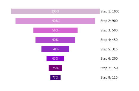
Funnel charts are a great way to represent any drop-offs in sample size throughout a series of steps. Using a little bit of Python handiwork in Sisense for Cloud Data Teams' R/Python integration, we can easily create this chart type.
A common use case for this chart type is to visualize your pipeline via a sales funnel. This is an extremely effective way to spot opportunities to improve your current sales process!
Below is the Python snippet used to create the funnel chart above and the input parameters.
Inputs
- df: a data frame from your SQL output with 2 columns: "step" (the parts of the process you want to visualize in a funnel chart) and "val" (the value associated with the Step in the funnel)
- show_n (optional parameter): boolean value that determines whether the user wants to display the value corresponding to each step. Default is set to True
- show_pct (optional parameter): parameter that determines whether the user wants to show each step as...
- A percent of the previous step ('of last step')
- A percent of the initial sample ('of whole')
- Show no percent values ('NA') - default value
Snippet
# SQL output is imported as a pandas dataframe variable called "df"
import pandas as pd
import matplotlib.pyplot as plt

# Function: funnel_chart, creates a funnel chart image from a dataframe of steps
# Inputs: (1) dataframe with 2 columns. The first is the "step", and the second is the "val" corresponding to each step. (2) Optional boolean parameter show_n (displays the n size of each step). (3) Optional paramater show_pct which allows the user to show each step of the funnel as a percent of the original n size ('of whole') or a percent or the previous step ('of last step')
# Output: matplotlib image representing a funnel chart
def funnel_chart(df, show_n=True,show_pct='NA'):
  #set up data frame
  df['val']=df['val'].astype(int)
  my_max=df['val'][0]
  df = df.sort_values('val',ascending=False).reset_index(drop=True)
  df['pct_of_whole']=round((df['val']/my_max)*100).astype(int)
  pct_change=[100]
  for j in range(1,len(df['val'])):
    pct_change.append(int(round(df['val'][j]/df['val'][j-1]*100)))
  df['pct_change']=pct_change
  df = df.sort_values('val').reset_index(drop=True)
  df['left']=(my_max-df['val'])/2
  df['col']=['indigo','purple','darkviolet','DarkOrchid','MediumOrchid','orchid','plum','thistle']

  #initialize plot
  fig, ax = plt.subplots()
  for i in range(len(df['step'])):
    ax.barh(0.5*i+0.5, df['val'][i], height=0.3, left=df['left'][i], align='center', color=df['col'][i],alpha = 1.0, label=df['step'][i])
    if(show_n==True):
      ax.annotate(' ' + df['step'][i] + ': ' + str(df['val'][i]),xy=(my_max,0.5*i+0.45),horizontalalignment='left')
    else:
      ax.annotate(' ' + df['step'][i],xy=(my_max,0.5*i+0.45),horizontalalignment='left')
    if(show_pct=='of whole'):
      ax.annotate(str(df['pct_of_whole'][i]) + '%' ,xy=(my_max/2,0.5*i+0.45),horizontalalignment='center',color='white')
    elif(show_pct=='of last step'):
      ax.annotate(str(df['pct_change'][i]) + '%' ,xy=(my_max/2,0.5*i+0.45),horizontalalignment='center',color='white')


  #remove border and align chart
  ax.axis('off')
  fig.subplots_adjust(right=0.8)

  return fig

# Use Sisense for Cloud Data Teams to visualize a dataframe or an image by passing data to periscope.output()
periscope.output(funnel_chart(df,show_n=True,show_pct='of last step'))
What other chart types do you like to use for your sales processes?
- Mark as Read
- Mark as New
- Bookmark
- Permalink
- Report Inappropriate Content
Is it possible to pass the chart to a dashboard?
Recommended Quick Links
- Community FAQs
- Community Welcome & Guidelines
- Discussion Posting Tips
- Partner Guidelines
- Profile Settings
- Ranks & Badges
Developers:
Product Feedback Forum:
Need additional support?:
The Legal Stuff
Have a question about the Sisense Community?
Email [email protected]
