Hello FollowTheData,
Thank you for reaching out, and welcome to the Community!
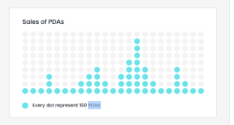
I believe the dot plot is a customization of a standard column chart. There are some posts here in the community that may help you get started with customizing your charts.
Column And Line Chart Formatting
Line Chart - Customizing a line to various "Dotted" styles
I also found this video about using Blox to create customized charts. Keep in mind this video is not produced by Sisense.
Please take a look at those and let us know you need any further assistance.