PDF export Troubleshooting
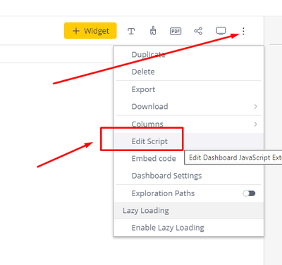
PDF export Troubleshooting NOTE: This is an updated version of the following community article - https://community.sisense.com/t5/knowledge/error-exporting-to-pdf/ta-p/9025 Let's review 2 possible problems with the PDF export - the export fails compl...