This website uses Cookies. Click Accept to agree to our website's cookie use as described in our Cookie Policy. Click Preferences to customize your cookie settings.
Turn on suggestions
Auto-suggest helps you quickly narrow down your search results by suggesting possible matches as you type.
Showing results for
Options
- Subscribe to RSS Feed
- Mark as New
- Mark as Read
- Bookmark
- Subscribe
- Printer Friendly Page
- Report Inappropriate Content
The content you are looking for has been archived. View related content below.
intapiuser

Community Team Member
Options
- Subscribe to RSS Feed
- Mark as New
- Mark as Read
- Bookmark
- Subscribe
- Printer Friendly Page
- Report Inappropriate Content
on
03-02-2023
09:41 AM
- edited on
07-21-2023
09:11 AM
by
slosada
![]()
Please note this article is useful for Windows users and users who use older Linux versions that pre-date the Analytical Engine.
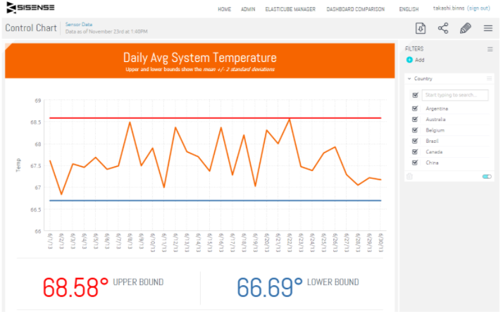
Control charts are a common way to show a trend line of some metric, as compared to an upper and lower boundary. This article explains how to create a control chart in Sisense.1
Step 1 - Create a Line Chart with the metric & mean
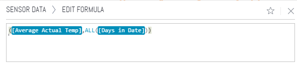
Create a standard line chart with time as the x-axis and pick a metric to use. For this example, machine temperature data was aggregated by day. Create the first measure as just the Avg Temp, to get a line chart that has Avg Temp per day. Then add a second measure that calculates the Avg Temp for all days. You can use a measured value to calculate the Avg Temp for ALL days, which will show a flat line across the chart. Star this formula as Avg Temp for All Days.
Step 2 - Calculate the Standard Deviation
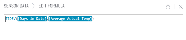
In order to create the upper and lower bounds, we need to figure out the standard deviation of the daily temperature. Sisense has a built-in function for calculating the standard deviation, you need to pass in the x-axis dimension (days in date) followed by the metric (Avg Temp). Star this formula as Avg Temp St Dev.
Step 3 - Create the Upper/Lower Bounds
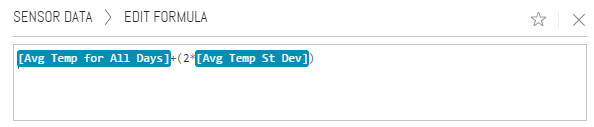
Now that we have the mean for all days and the standard deviation, we can calculate the upper and lower bounds. Create a new measure that adds the AvgTemp for All Days plus 2 x Avg Temp St Dev, and label it as Upper Bound. Create a similar measure that takes the Avg Temp for All Days and subtracts 2 x Avg Temp St Dev to get the Lower Bound.
Now if you hide toggle visibility on the Avg Temp for All Days and Avg Temp St Dev measures, you will end up with a chart that has the Avg Temp by day along with an upper and lower bound.
Step 4 (optional) - Auto-Adjust the y-Axis
You may notice that Sisense will start the y-axis at 0 by default. If you want this to be calculated dynamically, add the below code using the Edit Script button of the widget.
widget.on('ready', function(se, ev){
 // Parameters
 var seriesIndex = 0;
 var adjustmentPercent = 0.25;

 // Figure out the min/max
 var min = null,
     max = null;
 $.each(se.queryResult.series[seriesIndex].data, function() {
  if (!min || min > this.y) {
   min = this.y;
  }
  if (!max || max < this.y) {
   max = this.y;
  }
 })

 // adjust based on the delta
 var delta = max-min;
 max = max + (delta*adjustmentPercent);
 min = min - (delta*adjustmentPercent);

 // Set the min/max on the chart
 var e = element;
 var chart = e.data('hc');
 chart.alignTicks =false;
 chart.yAxis[0].update({max:max, min: min}, true);
})
References/Notes
- Control Chart Wiki
- Example Elasticube and Dashboard are attached below, the sample data came from a Hadoop Tutorial
- Sensor Data.ecdata
- ControlChart.dash
Labels:
Community Toolbox
Recommended quick links to assist you in optimizing your community experience:
- Community FAQs
- Community Welcome & Guidelines
- Discussion Posting Tips
- Partner Guidelines
- Profile Settings
- Ranks & Badges
Developers Group:
Product Feedback Forum:
Need additional support?:
The Legal Stuff
Have a question about the Sisense Community?
Email [email protected]
Share this page:
